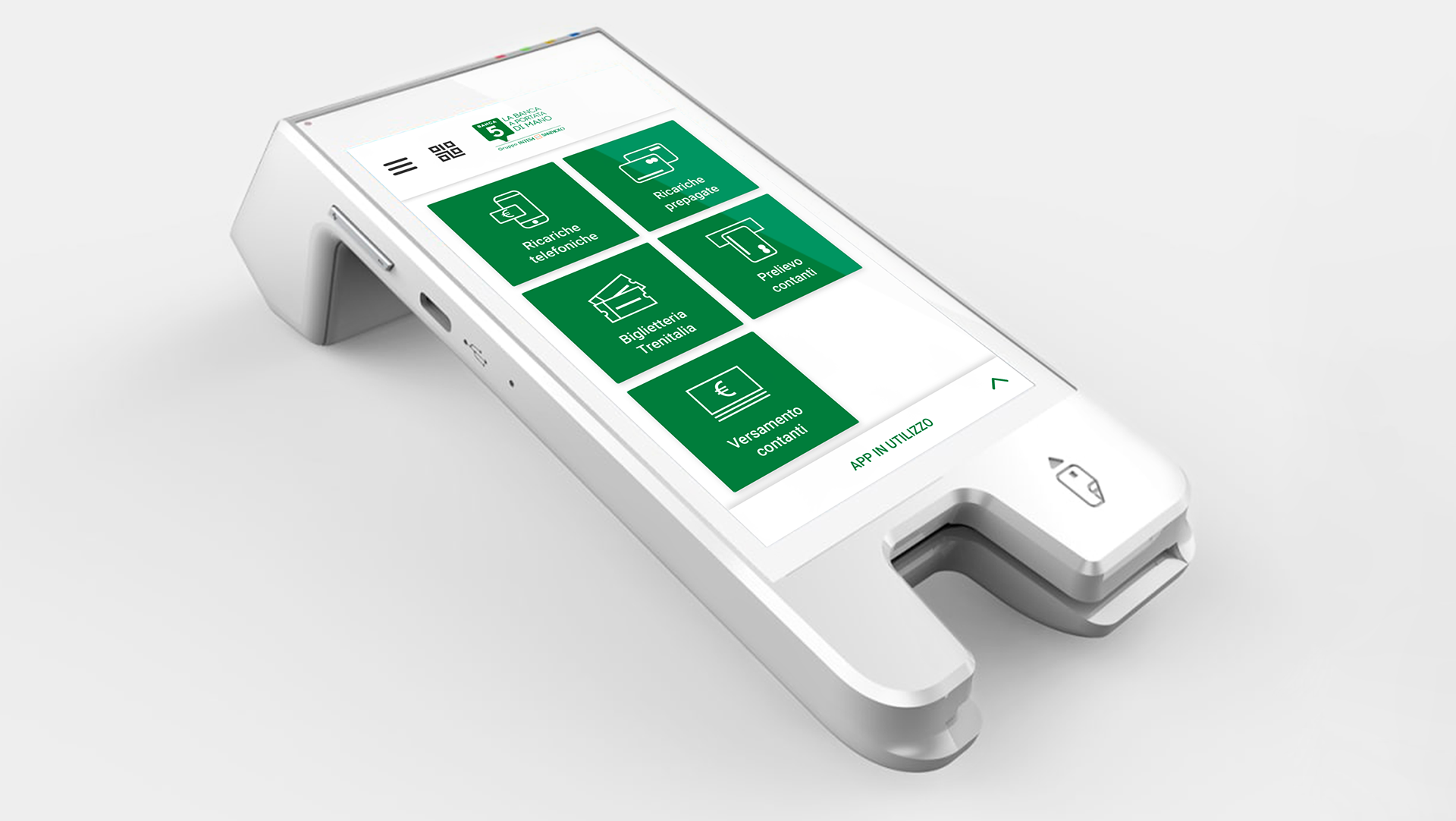
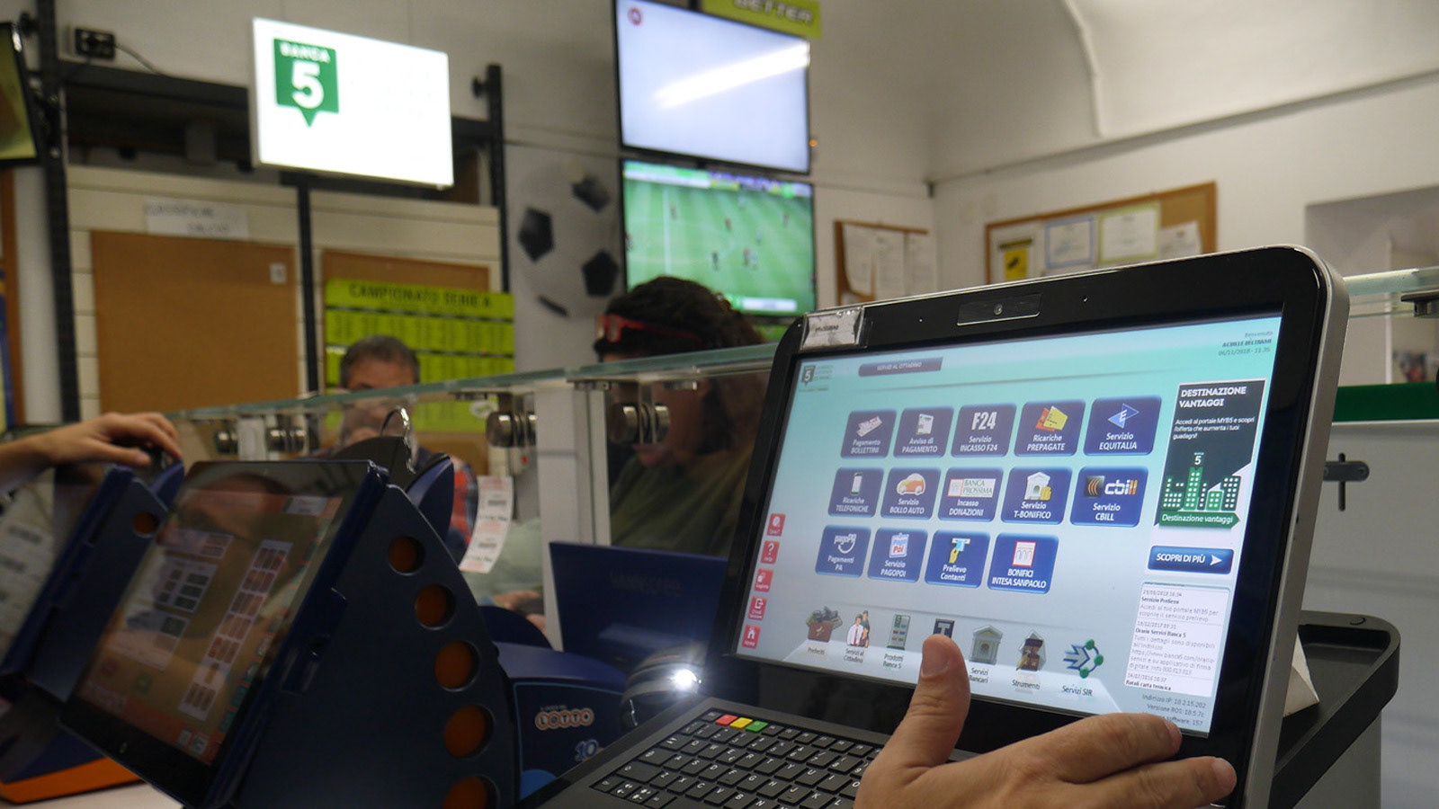
The client asked the visual interface design of the new Smart POS. This new device will be used, together with the "old" desktop device, in every Kiosks that have Banca 5 agreement.
The new device is small and portable compared to the old desktop version. A completely new interaction modality had to be designed to address these new criteria, along with a new UI system that will be used to update the desktop interface.
Assessment & discovery
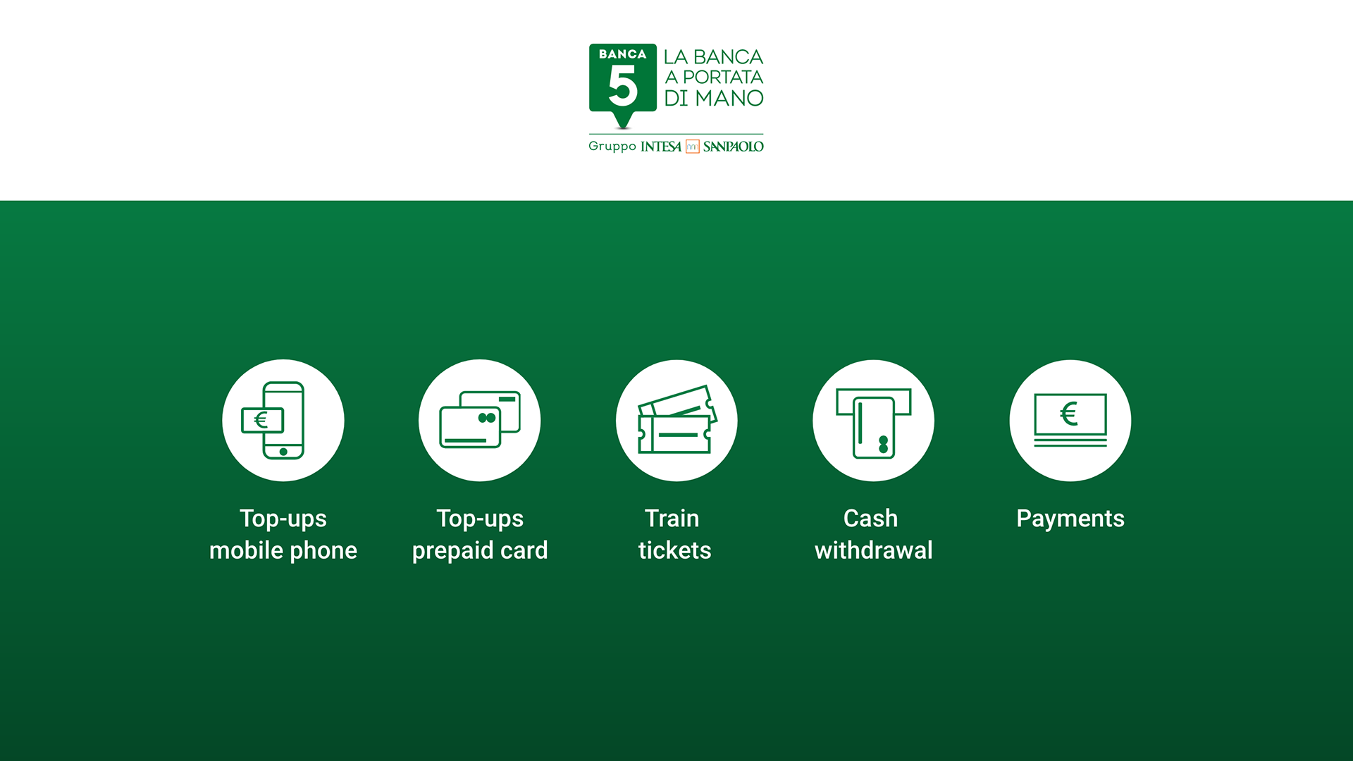
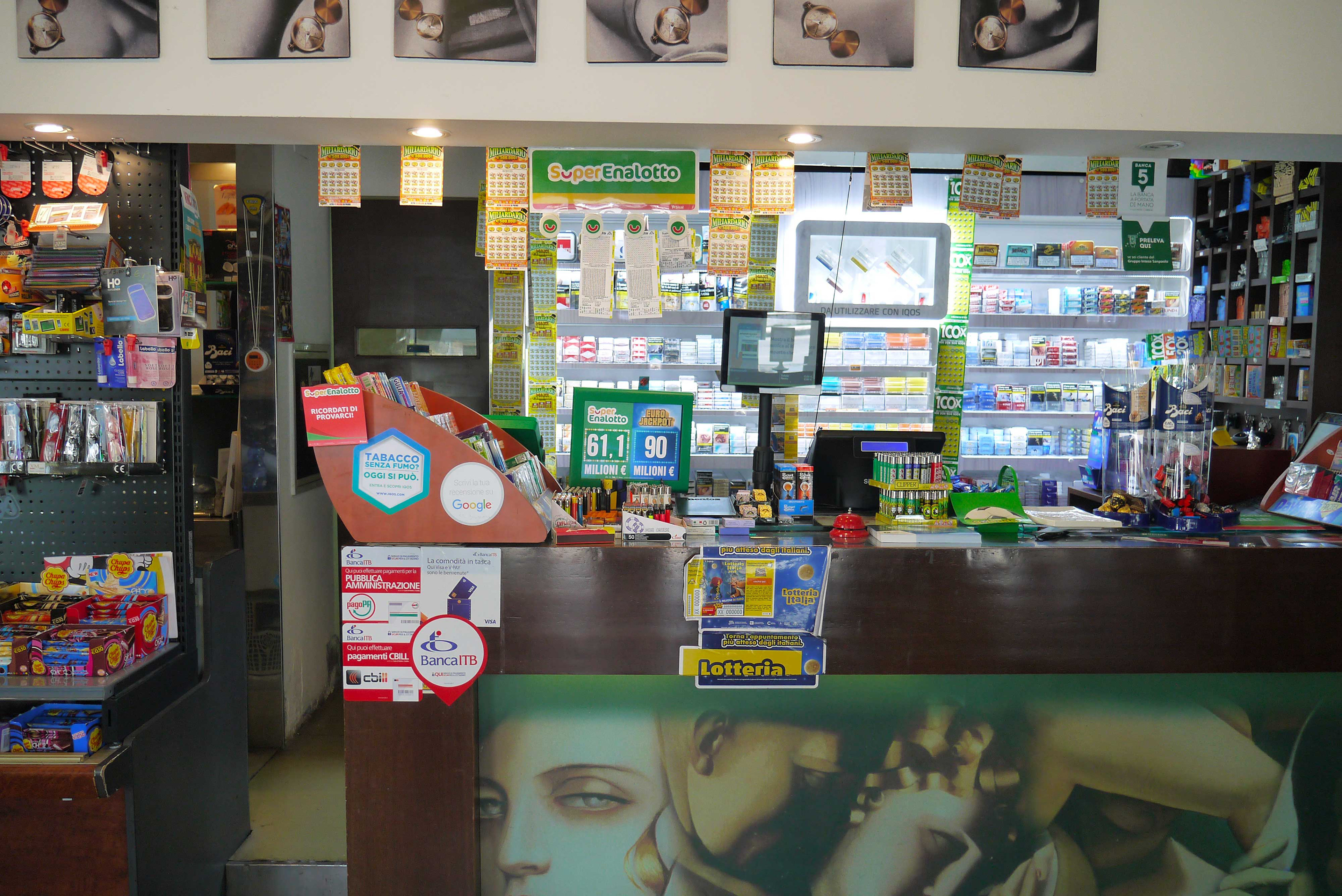
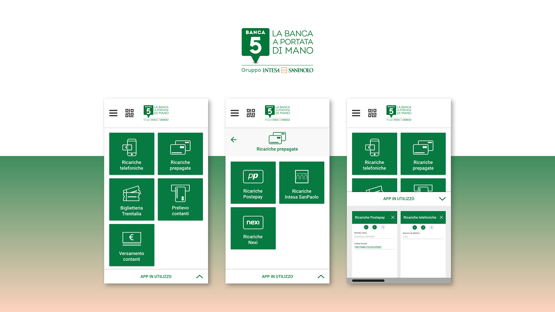
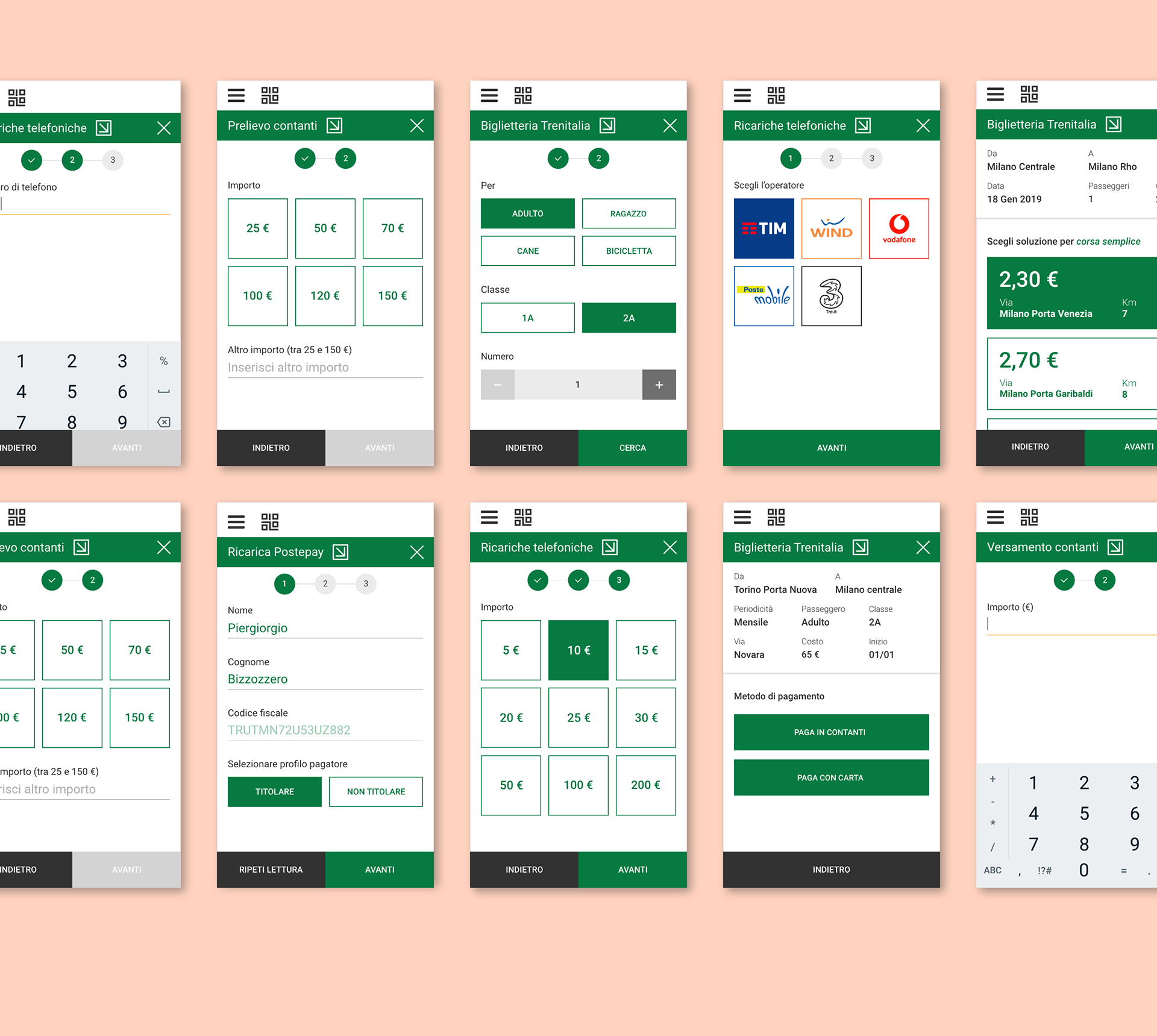
Banca 5 provides fourteen services for citizens, five of these were selected to be inserted in the first release of the new device because of their massive usage by tobacconists: top-ups mobile phone; top-ups prepaid card; train tickets; cash withdrawal; payments.
The analysis of each procedure was the starting point in order to identify: contents, numbers of steps, usability problems and interaction modality with the old device.
A significant challenge was the effective presentation of the large amount of contents related to each procedure, taking into consideration the new way of interaction: standing and with a smaller screen.
Field research
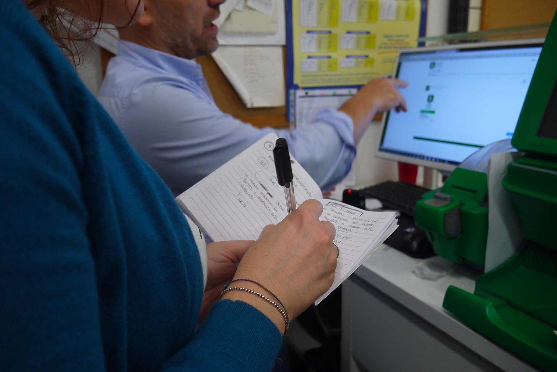
The project involved a series of stakeholder and tobacconists interviews.
The research aimed to gather useful information to define the UX of the new terminal (information architecture and page flow) and to intercept hidden needs and requirements of the tobacconists' overall experience with the old terminal and Banca5.

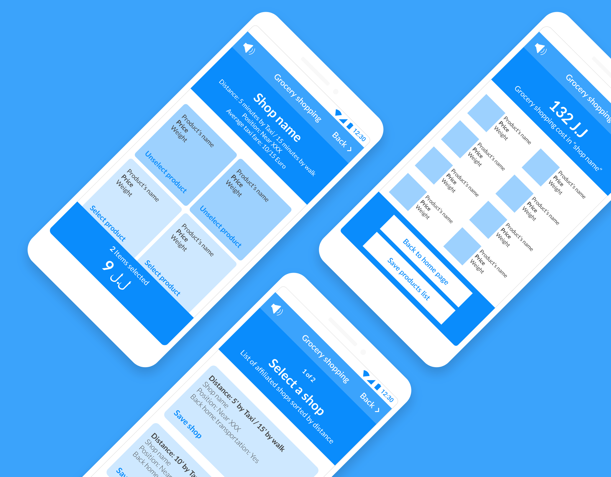
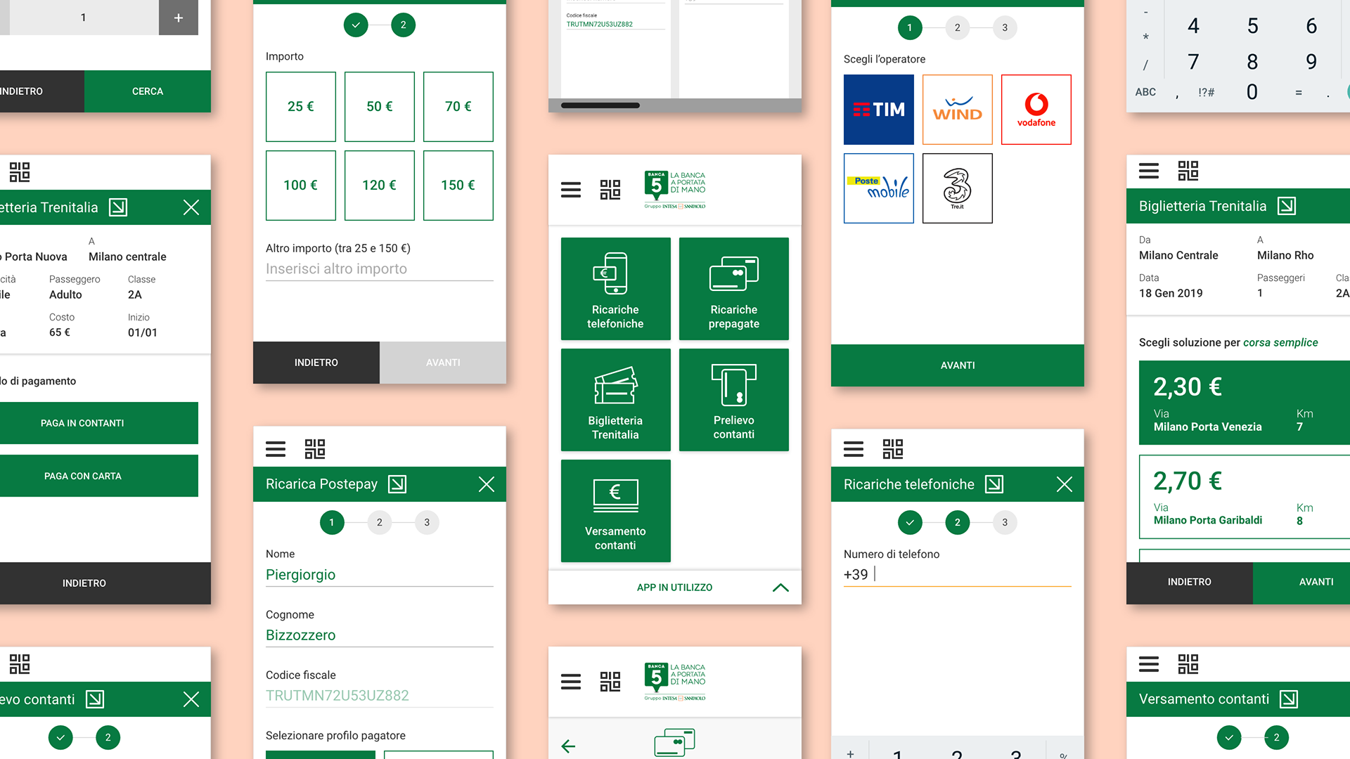
Smart POS design patterns
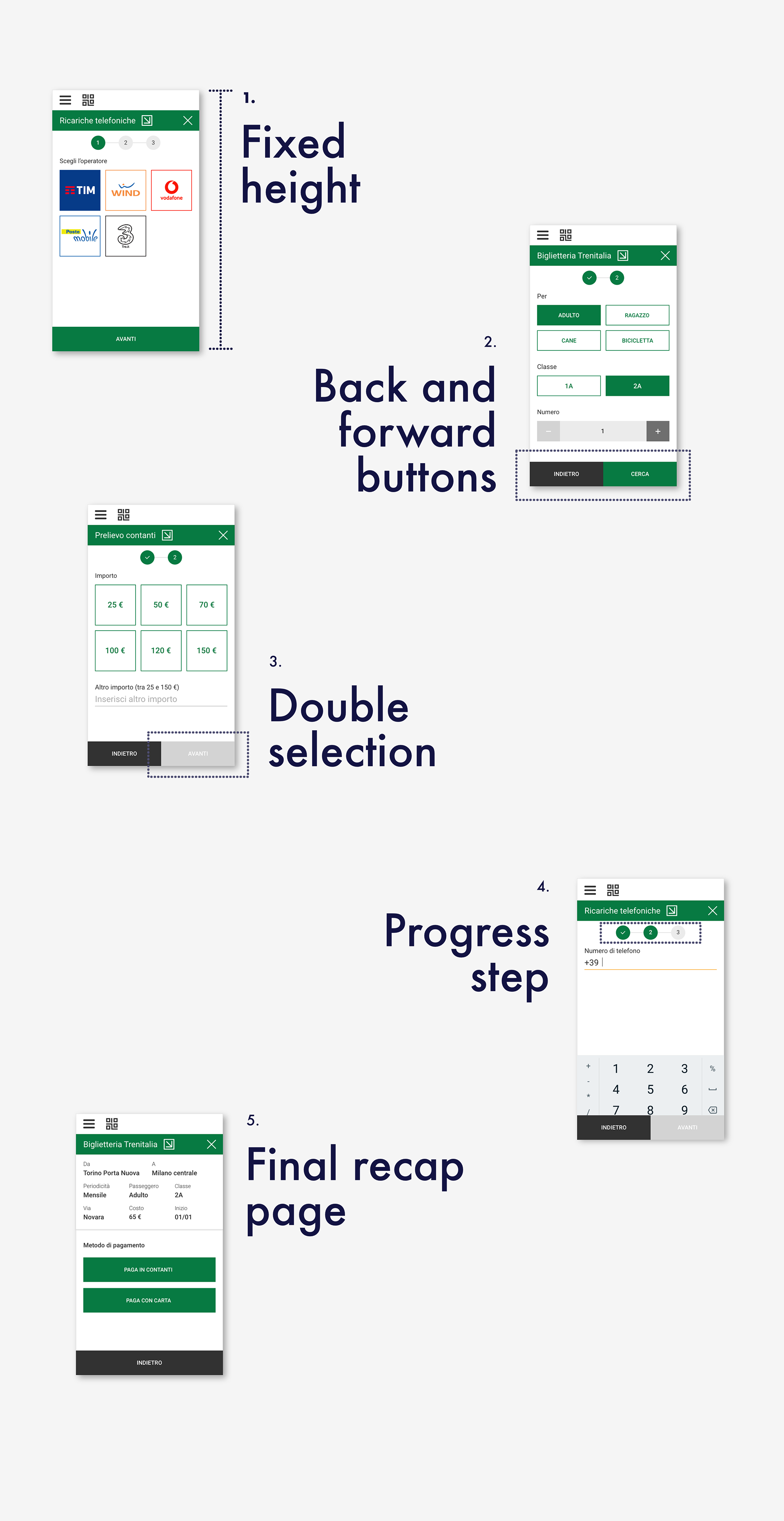
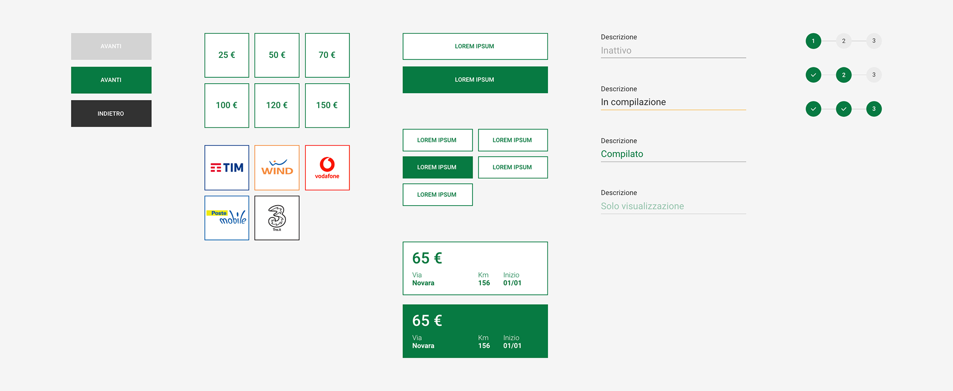
Fixed-height interfaces are implemented to prevent vertical scrolling, which could potentially lead tobacconists to make data input errors. As a result, processes are divided into multiple screens..
Back and forward buttons are fixed at the bottom of the page in all procedures to give a sense of control over the actions performed.
Double selection - The button "Forward" remains inactive if there is no element selected on the page. This interaction modality prevent error due to wrong click and allows the tobacconist to double check the input selected. Default states are applied to the most commonly used elements.
Progress step allows the user to know three different types of information: the number of steps to complete the procedure, the step where you are and the completed steps.
Final page recap including the payment method, ensures a standardized completion of transactions. This recap enables double verification of information and helps prevent significant errors.
User interface design
Together with the definition of the interaction patterns, the information architecture was developed and subsequently the wireframe of the whole platform. The wireframes led to some product iterations thanks to their visual and tangible value.
The visual design was delivered together with a detailed report with the IxD and UI guidelines.
Team
Caterina - UX designer & researcher
Elena - UX researcher
Mattia - Strategic designer
Ramona - UX & UI designer