Dalili is an app developed by World Food Programme for refugees in Lebanon. The app is placed within a program called: Food E-card; a debit card loaded monthly with a fixed budget that refugees can use in affiliated shops. The purpose of the app is to help compare prices in affiliated stores.
World Food Programme asked Experientia to perform an on-site research and a formative evaluation on the app to identify opportunities for its improvement. Based on the research two new app redesigned (wireframes) were proposed in order to meet users' needs.
On-site research
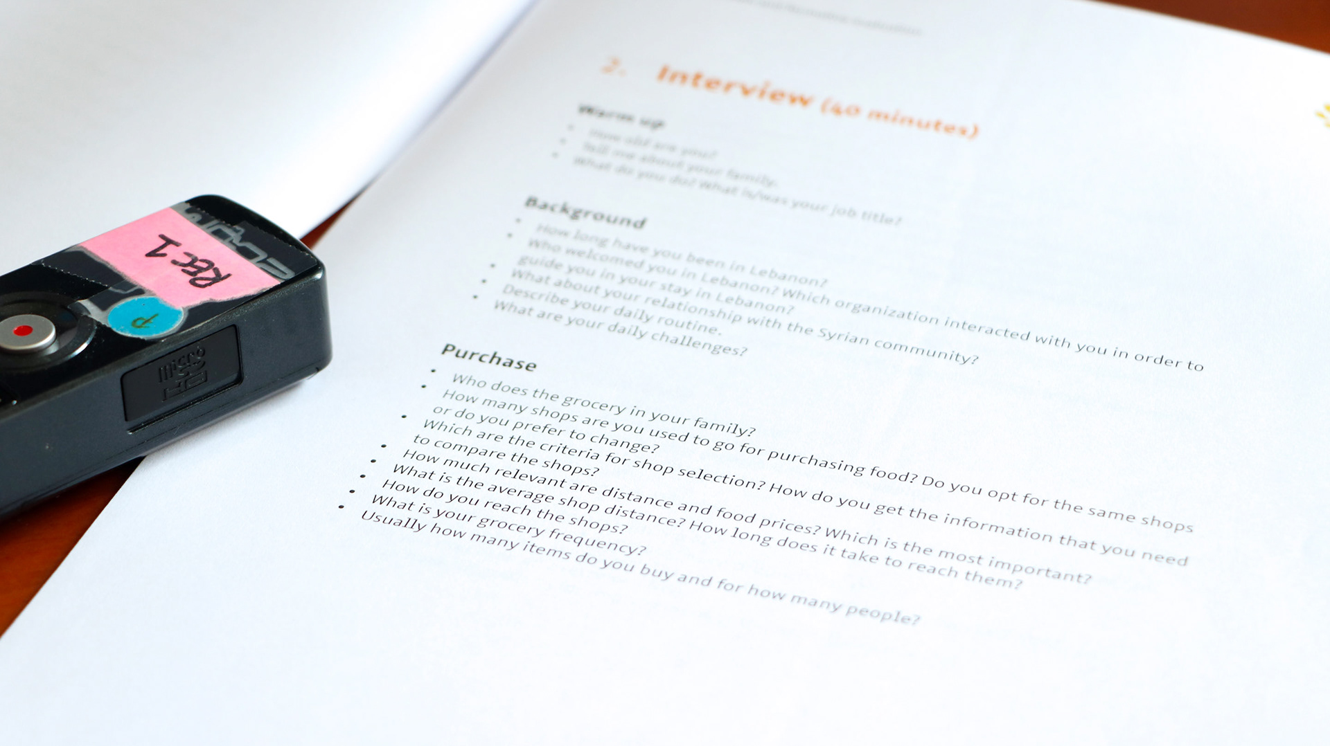
Experientia partnered with an Arabic collaborator in order to perform contextual interviews and formative evaluation of Dalili app in Beirut, Lebanon. Dividing the research in these two moments allowed us to spot problems related to the service and perception of Dalili overall experience as well as usability issues related to the app already in use by refugees.
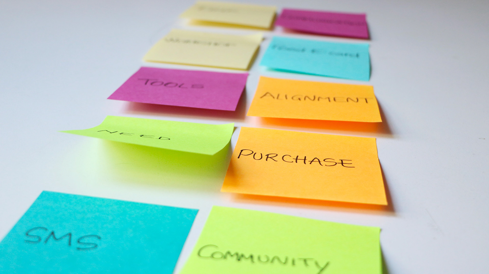
Main discoveries from the contextual interviews were:
The link between Dalili and Food E-Card programme was not so clear.
Depending on their living area, outside or inside the city, refugees rely the shop search on different parameters. Living outside cities: sort by distance of the shops; living inside cities: sort by price of products.
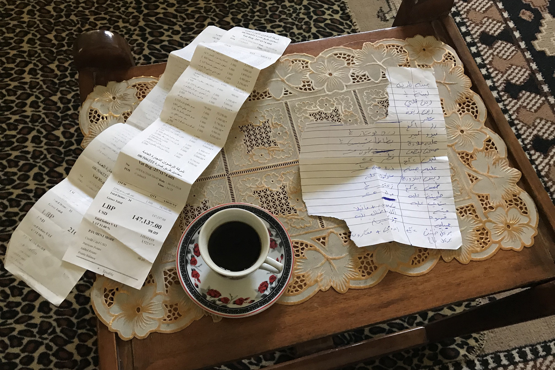
While shopping, people must keep the mental account of each product in order to stay within the given budget.
Inability to check if the bill is correct due to language barrier.
Customer Journey & opportunities
Many indications were given regarding the overall customer journey of Dalili, from the program's awareness to the purchase journey. Concerning the app the main guidelines were:
Awareness of technology: take into consideration the unfamiliarity of the target with technology. No menu paradigm, few levels of depth and back button always present in each screen.
Project connections: better integration of Dalili as one of the step in the customer journey of Food E-Card programme.
Shop choice factors: to address the whole target (refugees in the cities and outside) the app should have two different access points as follows: price of the products and distance of the shops. The taxi fare is a big issue for refugees not living in the cities, thus, provide in-app information about taxi fares would be highly useful.
Budget control: Dalili needs to be useful during the shopping experience. It is important to give the possibility to calculate prices thanks to a cart simulator.
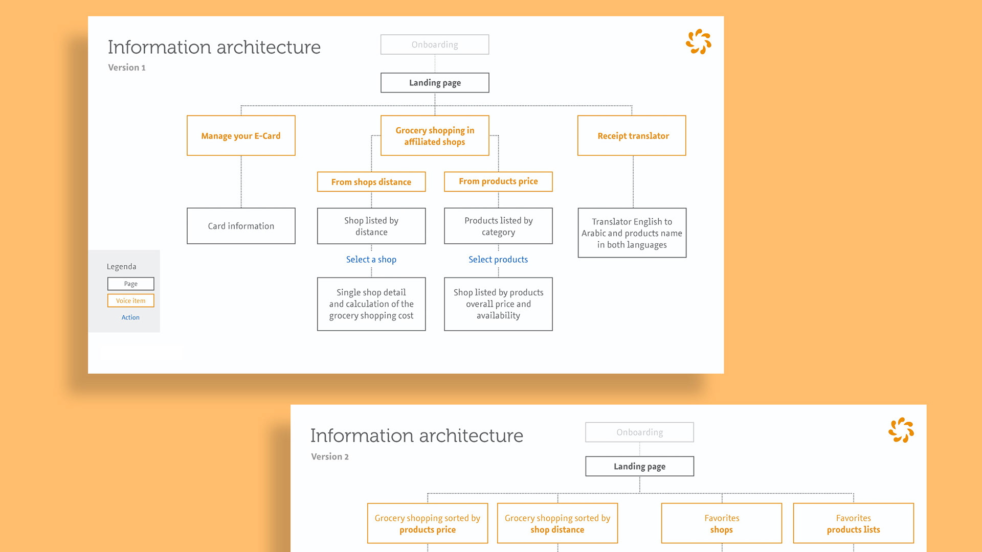
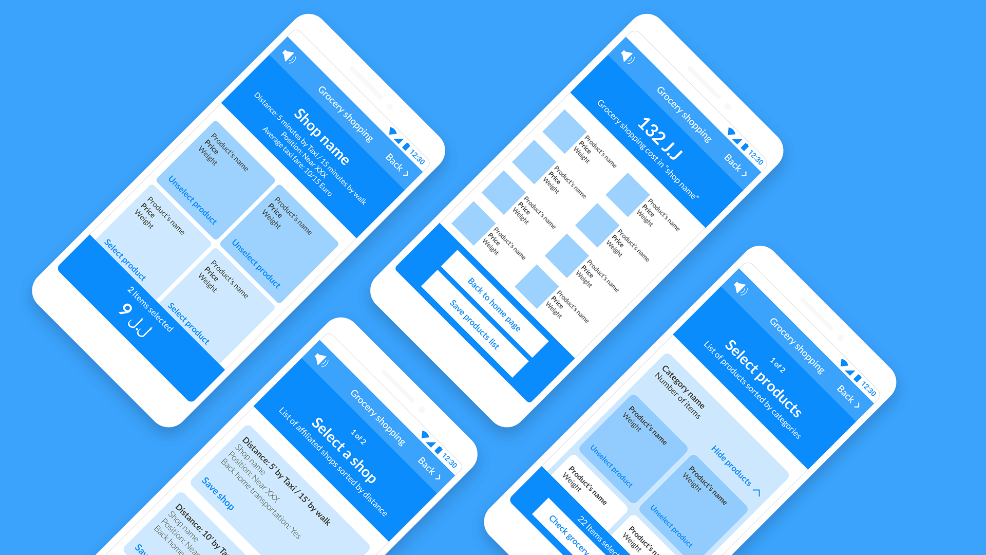
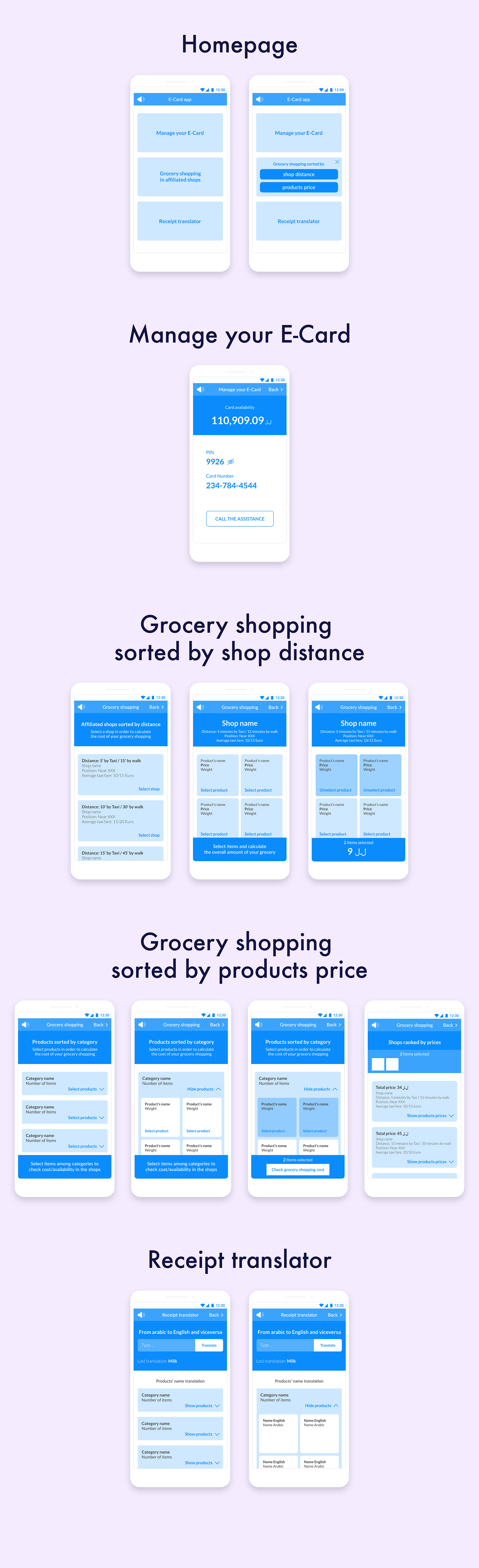
Wireframe proposal 1
This first wireframe is characterized by a clear and easy structure; the landing page has three access points each one leading to its related section: Card management, Grocery shopping and Receipt translator.
The app runs up to a maximum of two depth levels, thus enabling an easy web surfing and allowing the user to browse throughout the app without getting lost in the flow.
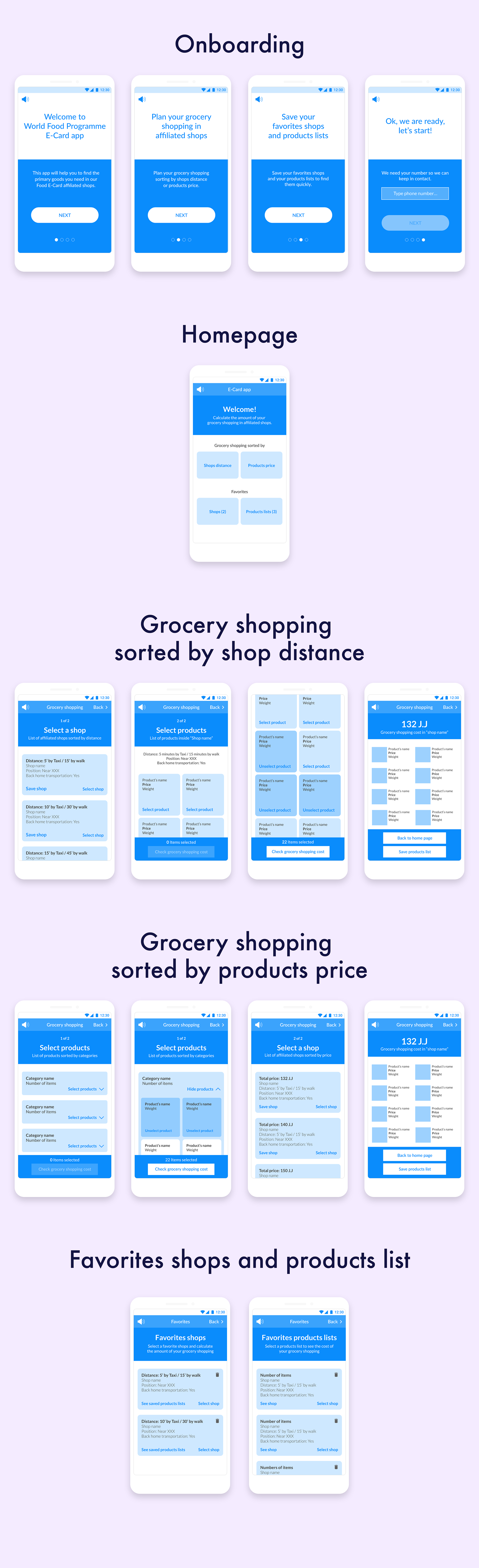
Wireframe proposal 2
Following the interaction choices of the previous version, the access buttons in the landing page provide an easy and direct connection with their related available features: grocery shopping sorted by shops distance or products price, favorites shops and products list.
All the flows in the app are shown as step-processes to enable the comprehension of the end-points/results.
Team
Caterina - UX designer & researcher
Elena - UX researcher
Lina - On-site UX researcher
Ramona - UX designer